


Let me preface this by saying that I am not a UI designer. I have a lot of respect for people who are skilled at building beautiful, intuitive interfaces, but I'm not one of them. I'm not good at it, and I don't particularly enjoy it. My interest is more on the backend, which is why I chose to start developing with Django and leveraging lightweight tools to make the frontend part as easy as possible.
To kickstart my portfolio of pet projects, I recently started developing a simple website to allow users (if I ever get any) to keep track of all their memberships and subscriptions in one place. The idea is to be able to fill in details like the start date, billing period and amount, free trial expiry date and maybe things like licence keys or membership numbers for each subscription, and opt-in to alerts when a trial period or fixed-term membership is about to expire. It's early days and the site likely won't be hosted publicly for several weeks, but the code is hosted on my GitHub.
When I started building the landing page, I decided to give Tailwind CSS a try. While it would certainly have been easier to stick with Bootstrap, I figured I may as well add another string to my bow if I was going to the trouble of building an actual website (and if it ends up looking terrible, there's no real harm since I'm not expecting anyone to use it anyway). The main appeal to me was the fact I could stay in HTML and avoid jumping in and out of my stylesheets every time I wanted to tweak something.
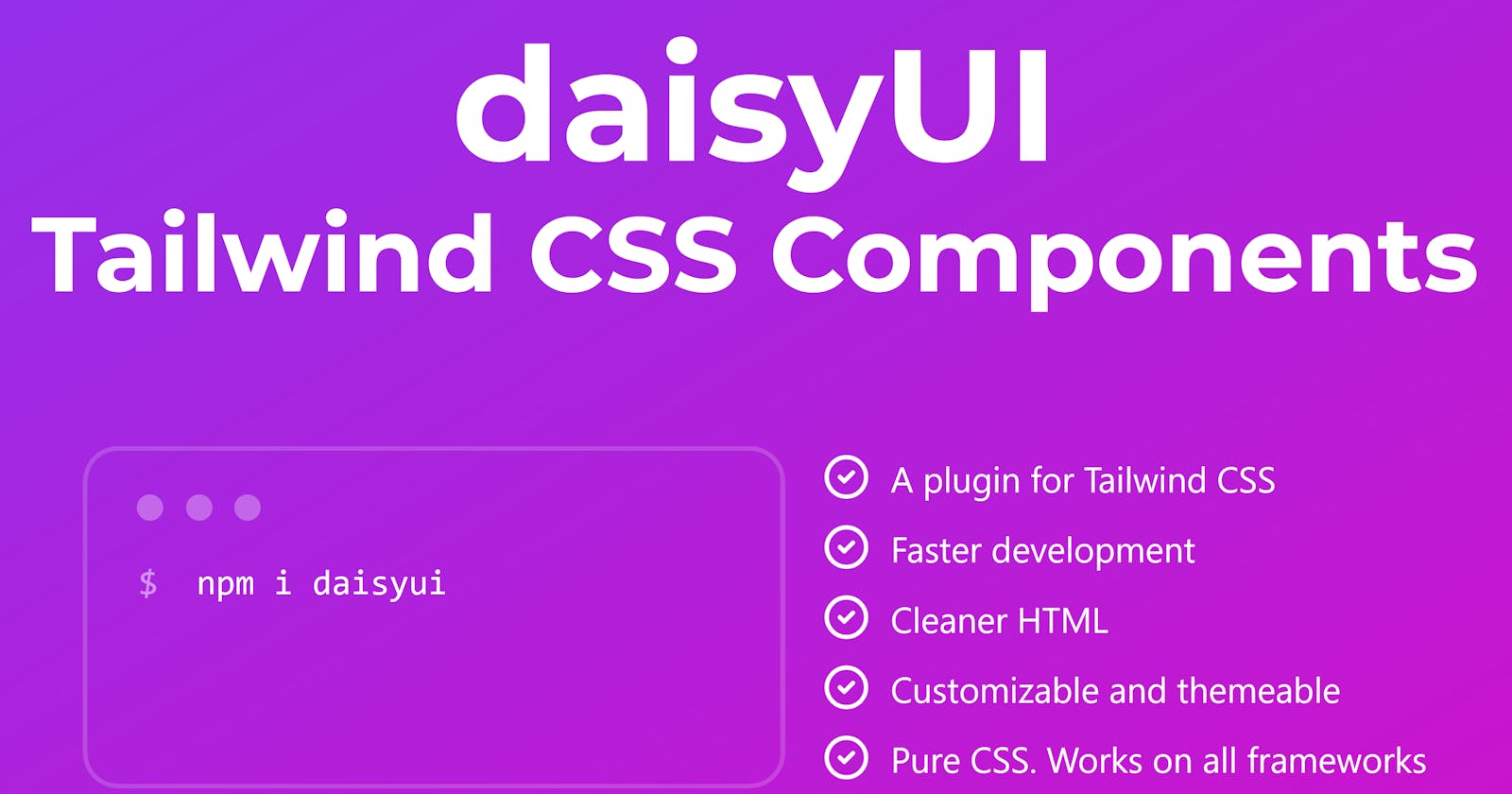
Just after I made this decision, a chance exchange with @zkat__ on Twitter led me to discover daisyUI. Installed as a plugin for Tailwind, daisyUI provides a whole bunch of component classes (bundles of Tailwind utility classes in a simple wrapper allowing you to add individual components like cards, buttons, alerts and menus to your site with a consistent look and feel). Nothing prevents you from using standard Tailwind classes to override daisyUI's styles or build your own components, but the plugin provides an enormous array of components out of the box.
Once I had installed Tailwind for Django, adding daisyUI was incredibly simple. Just take care to put require("daisyui") after the standard Tailwind requirements in your tailwind.config.js file (hint for Django n00bs like myself: this file is in the static_src folder of your Tailwind-specific theme app).
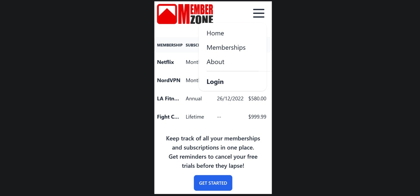
The first step in building my site was to create the navbar, which is the one component which will remain fixed across all pages of the site. daisyUI has numerous examples of navbar layouts on their site, one of which is a responsive navbar showing a centered menu of buttons on large screens and a toggled dropdown menu on small screens.
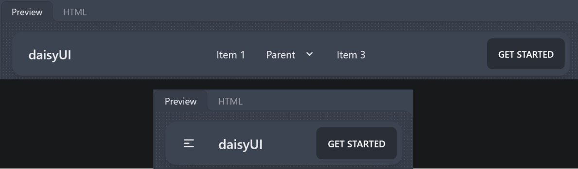 I knew I wanted a responsive site which would look good on mobile devices, so this was along the right lines. I opted to place the dropdown menu on the right, thus keeping the logo as an anchor in the top-left corner across all screen sizes. What I ended up with was the following (note that I'm using daisyUI's 'light' theme for my site; changing theme is as simple as adding the attribute
 data-theme="light" to the top-level html tag (in base.html).

Setting components as hidden or visible for a given screen size is as simple as putting hidden lg:flex or flex lg:hidden respectively (the Tailwind tags sm, md, lg etc. mean that the chosen style will apply to the given screen size or larger, so that lg will override sm on large screens for example).
Now to the body of the homepage, I wanted to show an example of the kind of interface users could expect on the site (along with some brief introductory text). Once again, daisyUI has a 'table' component with numerous examples on the site, so I was able to use this as a basis for my design. I embedded the table in a 'card' component to group related elements, giving the following layout on the desktop site:
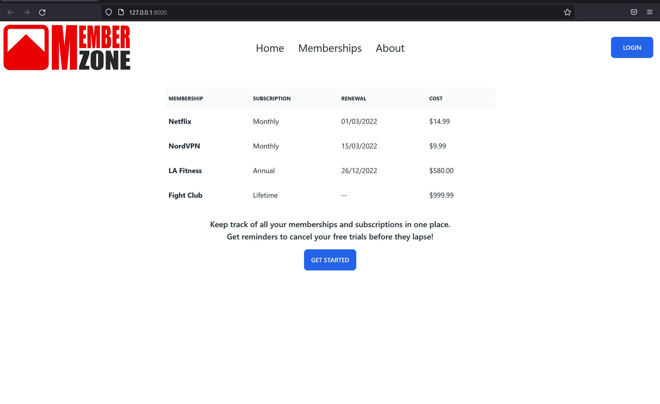 I set the width of the table to the full screen by default, overriding it with half-width on large screens (as seen in the image above). Fixing the relative width of the columns allowed me to more easily tune the appearance of the table on different screen sizes (
<table class="table table-fixed lg:w-1/2 w-full">). I also added the truncate class to the table header tags in the left column, allowing the text to be truncated as necessary to respect the column width on smaller screens. Specifying the styling for the text and button was similarly straightforward thanks to daisyUI's 'card' component: the text has the card-body class and the button has the card-actions class, with minor tweaks to the top margin in each case. The mobile version of the homepage looks like this (note that I've opened the dropdown menu in the top right so you can see the same 'Home', 'Memberships', 'About' and 'Login' options as on the desktop site):
It's safe to say that daisyUI has completely won me over, and I have no more worries about the use of Tailwind leading to messy, unmanageable HTML with dozens of utility classes in every tag. All of the usual Tailwind classes are still available should I want to customise the appearance of parts of my site, but daisyUI does most of the heavy lifting and I couldn't be happier with the result.
This blog post is the first of a series which I plan to write as the MemberZone site develops; the next post will focus on the use of htmx to add interactive single-page app style functionality to parts of the site without the need for React, Vue.js or any other bloated JavaScript framework.